
Best Urdu Fonts for Magazines – Complete Guide 2026

A magazine needs a font system, not one font: a display face for covers and headlines, a readable body face for long features, a compact face for captions, and genre voices for fashion, news and Islamic content. The ten picks below are chosen by magazine role — what each font does on a real page — with the criteria, layout tips and fixes a magazine editor actually needs.
Different medium? This is the magazines guide. For printed books see best Urdu fonts for book publishing, for reading devices best Urdu fonts for e-books and Kindle, and for the press best Urdu fonts for newspapers.
Table of Content
Table of Contents
What Makes a Font Good for Magazines
- Role clarity: headlines need impact at large sizes, body text needs hours of comfortable reading, captions need legibility at tiny sizes — one font rarely does all three.
- Pairing behaviour: the display face and the body face must sit on the same spread without clashing — Nastaliq display with Naskh body is the classic magazine pairing.
- Genre voice: a fashion spread, a news analysis and an Islamic feature want different moods — the picks below are grouped by the magazine genre they suit.
- Reproducibility: magazine fonts must survive print and screen editions alike; Unicode fonts do, legacy fonts do not.

Top 10 Urdu Fonts for Magazines
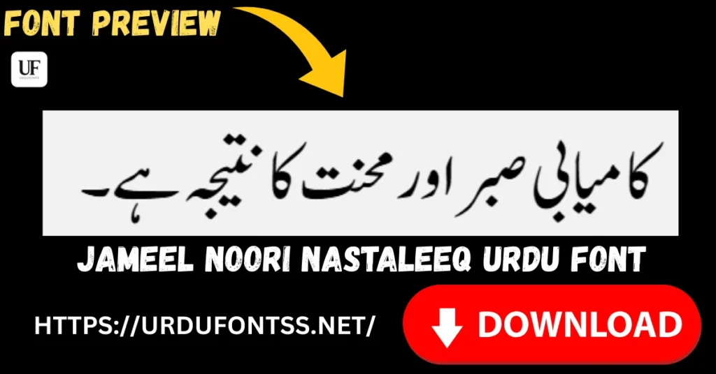
1. Jameel Noori Nastaleeq — the editorial body standard
For long magazine features, Jameel Noori Nastaleeq is the expected editorial voice — readers trust it for articles the way they trust it for newspapers.
2. Shamsheer Unicode — the clean headline cutter
Where Jameel is calligraphic, Shamsheer Unicode is plain and informational — ideal for news-section headlines and subheads that must read instantly.

3. Urdu Naskh Unicode — long-article comfort
Multi-page features and interviews read easiest in Urdu Naskh Unicode — a calm Naskh that never tires the eye, and light enough for digital editions.
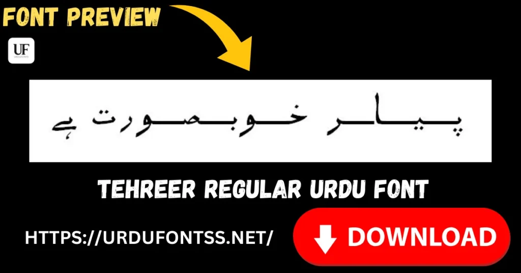
4. Tehreer Regular — the modern magazine voice
Lifestyle and youth titles that want a contemporary feel use Tehreer Regular — modern without being trendy, with 689 verified glyphs behind it.
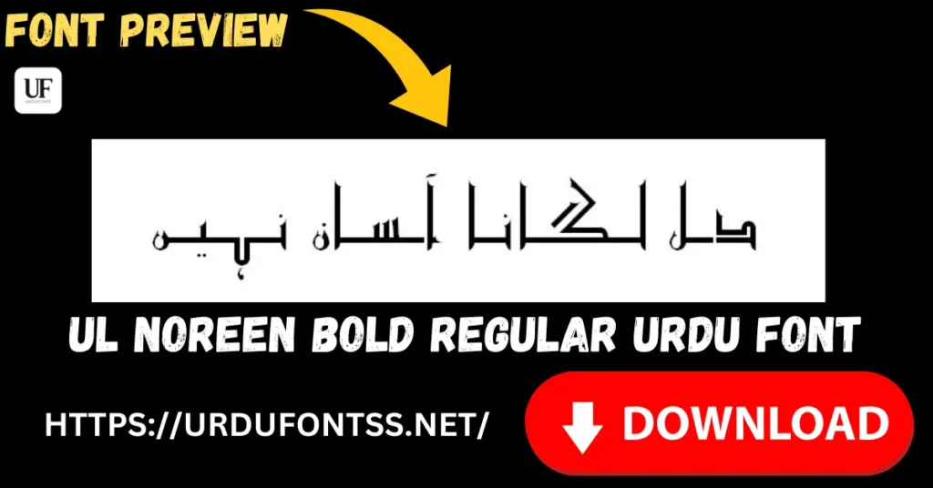
5. UL Noreen Bold — subheadings with hierarchy
UL Noreen Bold gives section breaks the weight they need — subheadings, pull-quotes and kickers that structure a feature.
6. Zohra Unicode — fashion spreads
Fashion and beauty pages want elegance; Zohra Unicode brings a softer, decorative hand that suits glossy spreads.

7. UL Sajid Heading — section headers
Purpose-built for headings, UL Sajid Heading marks sections, columns and recurring departments with a consistent masthead-like voice.
8. SF Koonj Regular — lifestyle features
For lifestyle, food and travel features, SF Koonj Regular reads warm and personal — a friendlier alternative to the formal editorial faces.
9. UL Amjad Regular — Islamic magazine body
Islamic monthlies need a dignified, steady body face; UL Amjad Regular carries religious features without decoration competing with the content.

10. Tafseer Regular — religious and scholarly content
For exegesis, scholarly columns and quoted texts, Tafseer Regular gives the classical, serious register such pages need.
Print vs Digital Considerations
- Print editions: test headlines at final size on paper — Nastaliq display faces need generous leading; embed all fonts in the print PDF.
- Digital editions: prefer lighter files (Naskh Unicode, Tehreer) for fast loading; check reflow on phones before publishing.
- Licence: magazine publishing is commercial — verify each font’s licence covers periodicals before the first issue.
Design Tips for Magazine Layout
- Two faces per spread, max: one display + one body; a third only for captions.
- Contrast by weight and style, not colour alone: Nastaliq headlines over Naskh body is the classic Urdu magazine rhythm.
- Captions at 8–9pt: test caption faces at final size — decorative faces fail here; plain ones win.
- Pull-quotes in the display face: reuse the headline font for pull-quotes to tie the spread together.
Common Problems & Solutions
| Problem | Solution |
|---|---|
| Headline font unreadable at final size | Decorative faces need large sizes — test at print size, or switch to a cleaner display face |
| Body font tires readers over long features | Move long articles to a calm Naskh (Urdu Naskh Unicode) and keep display faces for headings |
| Fonts missing in the print PDF | Embed or outline all fonts before sending to the printer |
| Web edition reflows badly on phones | Use lighter, reflow-safe fonts for digital editions; see the e-books and Kindle guide |
For general font rendering failures, see the common Urdu font problems and fixes guide.
Final Words
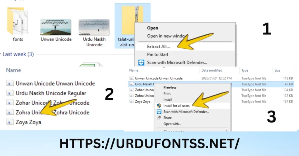
Build your magazine’s typography as a system — a display face for covers and headlines, a readable body face for features, a compact face for captions — and keep the same system across issues so readers learn your look. Download the fonts from their pages (the PC install guide covers setup), check the licences for periodical publishing, and proof a full spread before the first print run.
Frequently Asked Questions (FAQs)
Which Urdu font is best for magazine printing?
Jameel Noori Nastaleeq for editorial body text, with a display face (Shamsheer Unicode or Tehreer Regular) for headlines and UL Noreen Bold for subheadings — a three-face system covers a full issue.
What is the most readable Urdu font for magazines?
Urdu Naskh Unicode for long features — its calm, even letterforms stay comfortable over multi-page articles.
How do I choose Urdu fonts for a magazine layout?
Assign roles first: display, body, caption. Pick one face per role, check they pair well on a test spread, and keep the same system across issues.
What font size should Urdu magazine body text be?
10–12pt for Naskh body faces, 11–13pt for Nastaliq, with captions tested at their final 8–9pt size before committing.
Can I use these fonts for commercial magazine publishing?
Only where the licence allows. Free to download is not free to publish — verify each font’s licence terms for periodicals.
Which Urdu font is best for magazine headlines?
A display face with impact: Shamsheer Unicode for clean news headlines, Tehreer Regular for modern titles, or a decorative face like Zohra for fashion spreads.
How do I keep magazine fonts consistent across issues?
Define the three-face system (display, body, caption) as a style template in your layout app and reuse it — readers learn a magazine’s typographic voice quickly.


4 Comments