
Best Urdu Fonts for Newspapers – Complete Guide 2026

A newspaper’s typography has one job: be read fast, at small sizes, in narrow columns, day after day. The best Urdu fonts for newspapers are the proven press faces: Jameel Noori Nastaleeq for body and headlines, Shamsheer Unicode for plain, instant-reading headlines, Urdu Naskh Unicode for clean small text, and UL Noreen Bold for section headers. This guide builds the newspaper font system — masthead, headlines, body, captions, ads — with the sizes, column rules, e-paper notes and licensing a press designer needs.
Different medium? This is the newspapers guide. For printed books see best Urdu fonts for book publishing, for periodicals best Urdu fonts for magazines, and for reading devices best Urdu fonts for e-books and Kindle.
Table of Content
Table of Contents
What Newspapers Demand from a Font
- Small-size legibility: body text runs at 9–11pt in narrow columns — the font must stay clear where books’ fonts would fail.
- Headline impact: headlines compete on a crowded page — weight and contrast matter more than decoration.
- Column behaviour: narrow justified columns expose every weakness in Kashida handling and spacing.
- Daily reproducibility: the font must render identically across hundreds of editions, presses and PDFs — Unicode fonts do, legacy fonts do not.
- Role separation: masthead, headline, body, caption and ad fonts each do one job — readers navigate by the system.
The Picks: Fonts by Newspaper Role
Body text — Jameel Noori Nastaleeq
The press standard for Urdu body copy. Jameel Noori Nastaleeq (and its Kasheeda variant for justified columns) is what Urdu newspaper readers have read for decades — familiarity is a feature in daily news. Noori, Amar, Manzar and Faiz are the earlier press faces that shaped this tradition; their story is told in our history of Urdu typography.
Headlines — Shamsheer Unicode
For headlines that must read instantly at a glance, Shamsheer Unicode is plain and fast — the informational voice of news sections, tickers and breaking boxes.
Small text and tickers — Urdu Naskh Unicode
Captions, bylines, stock tables and tickers need a compact, even face — Urdu Naskh Unicode stays legible where decorative faces turn to noise.
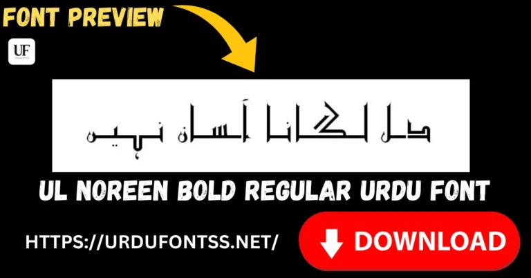
Section headers — UL Noreen Bold
Page sections, department headers and subheads need clear hierarchy — UL Noreen Bold separates sports, business and city pages at a glance.
Modern supplements — Tehreer Regular
Weekend magazines and youth supplements inside the paper can take a contemporary voice — Tehreer Regular gives them one, with 689 verified glyphs.
Advertisements — display faces on brief
Ad slots are the one place decoration wins — match the advertiser’s brief with a display face from the Urdu fonts category, but keep the paper’s own content in the press system above.
Columns, Sizes and Print Specifics
- Body: 9.5–11pt Jameel Noori Nastaleeq in narrow columns, with Kashida justification enabled for even lines.
- Headlines: 18–36pt depending on the story’s weight; Shamsheer’s plainness keeps big sizes readable.
- Captions: 8–9pt in a Naskh face — test every caption at final size before press.
- Ink and paper: newsprint bleeds slightly — avoid very thin strokes and tiny counters; prefer the sturdier weights.
- Proof the front page daily: the front page is the paper’s face — check headline/body contrast on every edition’s first proof.
E-paper and Digital Editions
- Use Unicode only: e-paper PDFs and web editions must embed Unicode fonts — legacy fonts break on readers’ devices.
- Embed, don’t assume: export press PDFs with all fonts embedded so the e-paper matches the print page.
- Prefer lighter faces for web: Naskh Unicode and Tehreer load fast in web readers; heavy calligraphic faces slow them down.
- Test on phones: most e-paper reading now happens on phones — check the front page and one inside page on a phone before publishing.
Typesetting Tools (a Short Note)
Many Urdu presses still set pages in InPage, while newer workflows use InDesign with Urdu support. Whichever tool you use, the requirement is the same: a Unicode font with Kashida justification. The tool is a detail — the font system above is what readers see.
Licensing for Publishers
Newspaper publishing is commercial use, full stop. Free to download is not free to publish — verify each font’s licence covers periodical and commercial use before it appears in print. Keep the licence records with the paper’s production files.
Common Problems & Solutions
| Problem | Solution |
|---|---|
| Narrow columns look ragged | Enable Kashida justification and use a font with Kashida support (Jameel Noori Nastaleeq Kasheeda) |
| Body text unreadable at 9pt | Decorative faces fail at press sizes — move body copy to Jameel Noori Nastaleeq or a Naskh face |
| E-paper shows boxes on readers’ phones | The PDF has no embedded Urdu font — export with all fonts embedded |
| Headlines blur on newsprint | Newsprint bleeds — use sturdier weights and avoid very thin strokes at headline sizes |
For general rendering failures, see the common Urdu font problems and fixes guide.
Final Words
A newspaper’s typography is a system, not a showcase: Jameel Noori Nastaleeq for the body readers trust, Shamsheer Unicode for headlines that read at a glance, a Naskh face for the small print, and display faces reserved for ads and supplements. Keep it Unicode, embed it in every PDF, check the licences, and proof the front page of every edition.
Frequently Asked Questions (FAQs)
Which Urdu font is used in newspapers?
Jameel Noori Nastaleeq is the long-standing press standard for Urdu body text and headlines, with Shamsheer Unicode and Urdu Naskh Unicode common for headlines and small text.
What font size do Urdu newspapers use?
Body text typically runs 9.5–11pt in narrow columns, headlines 18–36pt by story weight, and captions around 8–9pt.
Which font is best for Urdu newspaper headlines?
A plain, high-impact face like Shamsheer Unicode for instant reading, or Jameel Noori Nastaleeq for the traditional press look.
Can I use these fonts for commercial newspaper publishing?
Only where the licence allows. Newspaper publishing is commercial use — verify each font’s licence terms before it goes to print.
Why do Urdu e-papers show boxes on phones?
The PDF has no embedded Unicode Urdu font. Export press PDFs with all fonts embedded so the e-paper renders everywhere.
Do newspapers still use InPage?
Many Urdu presses still set pages in InPage, though newer workflows use InDesign with Urdu support. Either way, use a Unicode font with Kashida justification.
What makes a font work in narrow newspaper columns?
Good Kashida support for even justified lines, sturdy strokes that survive newsprint, and legibility at 9–11pt — Jameel Noori Nastaleeq Kasheeda is the classic answer.

6 Comments