
Best Urdu Fonts for Book Publishing & Printing – Author’s Guide

The best Urdu fonts for book publishing are the ones that survive hundreds of printed pages: Jameel Noori Nastaleeq for traditional books, Urdu Naskh Unicode for modern and academic text, Al Qalam Quran Majeed for Quran printing, and Tehreer Regular for contemporary titles. Choose by print behaviour — justified columns, Kashida support and print-safe sizes — not by how a font looks on a screen. This guide gives the print criteria, the picks, and the fixes for the problems publishers meet.
Looking for a different medium? This is the print books guide. For periodicals see best Urdu fonts for magazines, for reading devices best Urdu fonts for e-books and Kindle, and for the press best Urdu fonts for newspapers — each with criteria fit to its medium.
Table of Content
Table of Contents
What Makes a Font Work for Book Publishing
- Long-form readability: the font must stay comfortable across thousands of words — even strokes, open counters, no eye-tiring decoration.
- Justified-column behaviour: Urdu books are usually set fully justified; the font should work with Kashida (elongation) so lines fill evenly without ugly gaps.
- Print-safe at body size: Nastaliq fonts with very tall ascenders need generous leading or lines collide in print — test at 11–13pt on paper, not just on screen.
- Licence for print runs: commercial publishing needs a font whose licence covers books — free to download is not the same as free to publish; check each font’s terms.
- Complete glyph coverage: novels, textbooks and religious books need the full Urdu character set plus marks — missing glyphs surface as boxes mid-run.
The Picks: Best Urdu Fonts for Books
Urdu novels and poetry — Jameel Noori Nastaleeq
The industry standard for Urdu fiction and verse. Its sloped Nastaliq is what readers expect on a novel’s page, and Jameel Noori Nastaleeq (with the Kasheeda variant for justified paragraphs) handles long text reliably.
Academic textbooks — Urdu Naskh Unicode
Modern publications and textbooks read best in a clean Naskh. Urdu Naskh Unicode Regular is light, neutral and dependable at body sizes — the calm choice when content, not calligraphy, must carry the page.
Quran and Islamic books — Al Qalam Quran Majeed
Scripture needs full marking support and a classical hand. Al Qalam Quran Majeed is built for Quranic Arabic with the vowel marks and spacing religious printing requires.
Contemporary books — Tehreer Regular
For minimal, modern titles, Tehreer Regular gives a clean, understated line with 689 verified glyphs — contemporary feel without calligraphic weight.
Manuals and instructional books — UL Amjad Regular
Instructional text needs a sturdy, highly legible face. UL Amjad Regular holds up in dense step-by-step layouts.
Chapter headings — UL Noreen Bold
Headings need weight contrast against the body. UL Noreen Bold Regular is a natural chapter-title companion to any of the body fonts above.
Open-licence option — Noto Nastaliq Urdu
When a project needs a clearly open licence, Noto Nastaliq Urdu from Google Fonts is the well-known open-licensed Nastaliq — check its current licence on the Google Fonts page before a commercial run.
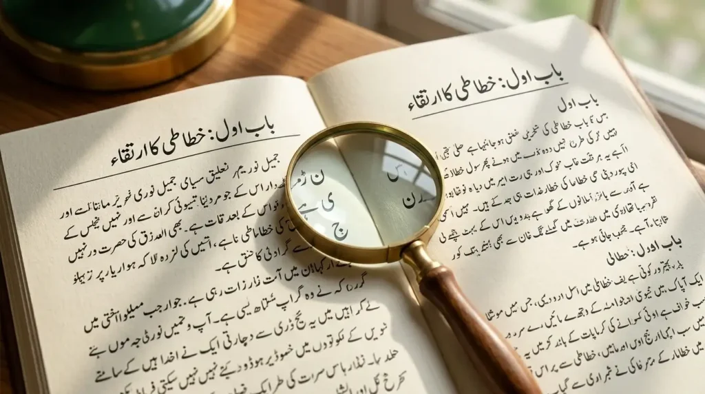
Nastaleeq vs Naskh for Books
Choose Nastaleeq for traditional fiction, poetry and religious publishing — it is what the audience expects. Choose Naskh for textbooks, manuals, children’s books and anything where clarity at small sizes matters most. The deeper comparison is in our Urdu Nastaliq fonts guide.
Font Size and Line Spacing for Print
- Body text: 11–13pt for Nastaliq faces (their tall lines need the room), 10–12pt for Naskh.
- Leading: set line spacing at least 1.4× the font size for Nastaliq to prevent mark collisions.
- Margins: Urdu’s tall line height eats page space — plan generous top and bottom margins before finalising the page count.
- Proof on paper: always print a test chapter; screen rendering hides the collisions and tight leading that print reveals.
Why Some Urdu Fonts Fail in Print
The usual culprits: non-Unicode fonts that looked fine in one app but break in the printer’s RIP; fonts without Kashida support producing ragged justified columns; missing glyphs appearing as boxes; and display fonts chosen for a cover being set as body text. Fix each by switching to a Unicode print-tested font from the picks above and re-proofing. The common Urdu font problems and fixes guide covers the general rendering failures.
Common Problems & Solutions
| Problem | Solution |
|---|---|
| Justified columns look ragged | Use a font with Kashida support (Jameel Noori Nastaleeq Kasheeda) and enable Kashida justification in the layout app |
| Lines collide in print | Increase leading to at least 1.4× for Nastaliq faces |
| Boxes appear mid-run | A glyph is missing from the font — switch to a full-coverage Unicode font and re-proof |
| Font looks different at the printer | Embed or outline the fonts in the PDF; never send a printer un-embedded live text |
Final Words
For printed Urdu books, judge fonts on paper, not on screen: Jameel Noori Nastaleeq for traditional titles, Urdu Naskh Unicode for modern and academic text, Al Qalam Quran Majeed for scripture, and Tehreer for contemporary design. Check the licence for your print run, proof a full chapter, and the book will read as well as it looks.
Frequently Asked Questions (FAQs)
Which Urdu font is best for book publishing?
For traditional books, Jameel Noori Nastaleeq; for modern and academic books, Urdu Naskh Unicode; for Quran printing, Al Qalam Quran Majeed. Match the font to the book’s genre and always proof on paper.
Should I use Nastaleeq or Naskh for an Urdu book?
Nastaleeq for fiction, poetry and religious publishing — the expected traditional look. Naskh for textbooks, manuals and children’s books, where clarity at small sizes matters most.
What font size works for Urdu books?
11–13pt for Nastaliq faces and 10–12pt for Naskh, with leading of at least 1.4× for Nastaliq so tall lines and marks do not collide.
Why do Urdu fonts fail during printing?
Usually non-Unicode fonts, missing Kashida support in justified columns, incomplete glyph coverage, or fonts not embedded in the print PDF — each has a fix in the problems table above.
Can I use free Urdu fonts for commercial book publishing?
Only if the licence allows it. Free to download is not free to publish — check each font’s licence terms for print runs before committing to a title.
Which font is best for Urdu poetry books?
Jameel Noori Nastaleeq — its calligraphic slope is the traditional voice of Urdu verse, and it handles the long lines of poetry well.
What tools help with Urdu book typography?
A layout app with Kashida justification (InDesign with the right settings, or InPage for traditional workflows), plus a Unicode font from the picks above — and always a printed proof before the full run.

9 Comments